Demo: Neocolor Pastels (dry method)
This demo covers the basics of using Neocolor black and white pastels. The pastels are waxy and can be smudged easily or layered one color on top of the other. Here the white also acts like an eraser - wiping out areas that are incorrect. In the very last image I decided to bring in a tiny amount of Titanium White acrylic paint to further enhance the highlights.
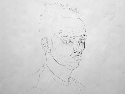
01. I dive into the drawing using a local tone and looking for positive and negative space (no intercross was used here so I have to be prepared to tackle certain proportional issues as I proceed).
02. I begin bringing in some of the largest dark shapes into the dark gray local tone.
03. I realize I have drawn the nose too pointy and high so I use the white pastel to white out the nose and mouth region. At this point I'm no longer playing it safe and locked in to wherever this drawing is heading.
04. I begin working back in the mouth and nose area and developing more of the darker shapes of the head.
05. I start pushing back the overall value of the head as I realize that I have made the local tone a bit too light overall.
06. I feel okay about the basic proportions of the largest value shapes of the head so I begin recording the smaller highlights.
07. I rework the mouth and chin a bit as I realize the angle of the mouth area needs to be a bit more vertical than I had it. About 35 minutes have gone by.
08. The drawing looked okay in the previous state but I wanted to push things further. Things had become a little too safe and I wanted to put some risk back into the rendering. I begin adding some white and finger smudging with the black on the left side of the face to lighten it just a little and I begin finger smudging everywhere to smooth out the values. This got rid of most of the grainy texture seen in the above images. The drawing enters a bit of a new awkward phase as it did when I wiped out the mouth in step 03 but I'm ready to keep pushing and make something happen.
09. I continue adding some white or some black and finger smudging to smooth out the transitions. I don't want all the transitions to be smooth as some are quite hard-edged but in general I wanted to create a convincing flow of value around the head, neck and shoulders. Some areas in general are darkened (front of forehead) while other areas begin to be lightened (top of hair).
10. I felt okay with the last state of the drawing but it lacked a certain "zing" that the original had. I give the drawing about another 5-10 minutes using Titanium White acrylic paint and a small brush to make some of the highlights more striking. Some of the pastel highlights are left untouched while others are made whiter. This gave me the overall contrast I was seeking. Compare this drawing with the previous step. With the addition of only one more value (with the white paint) I have increased the overall value range just enough to create a far more dramatic and finished drawing. Think back on the process of this demo: big shapes before small shapes, basic proportions before details, risk was embraced even if it meant the drawing would appear awkward for a bit before growing strong again.


%20-drawing_detail1494.jpg)
Comments